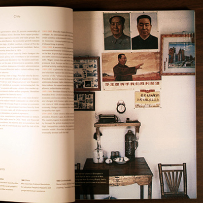
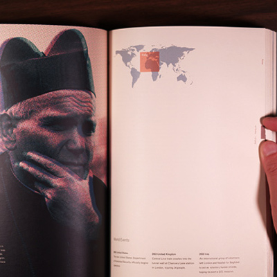
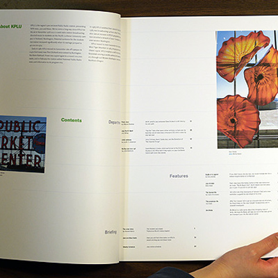
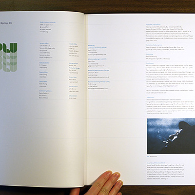
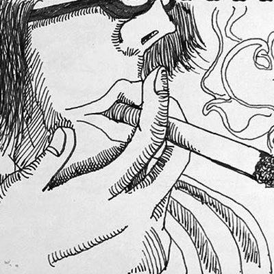
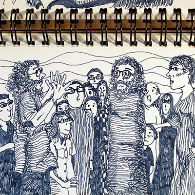
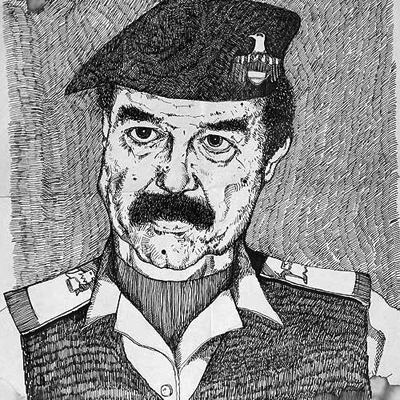
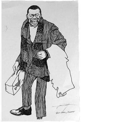
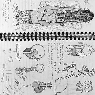
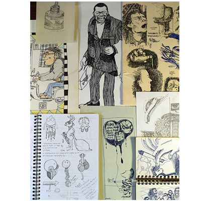
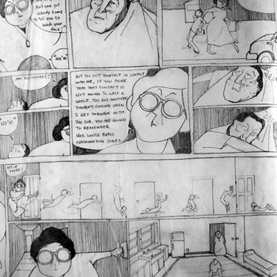
All images shown here are intended to demonstrate my capability in crafting visual forms and story.
Contact:
hankhhuang@outlook.com
✖
no linkedin
no fackbook
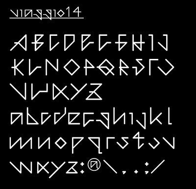
viaggio14
work in progress...
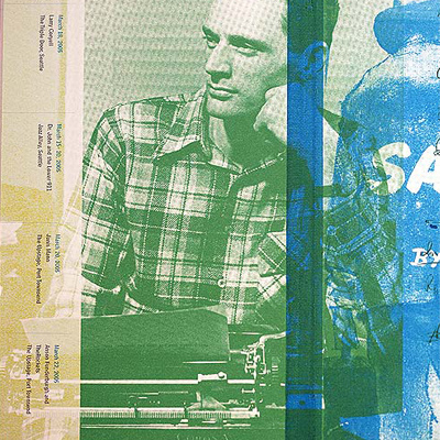
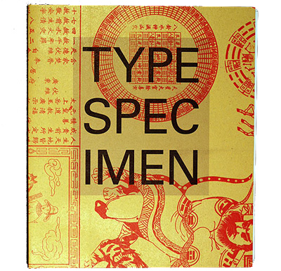
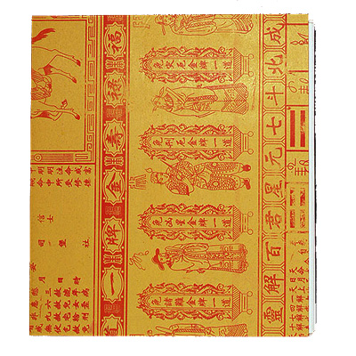
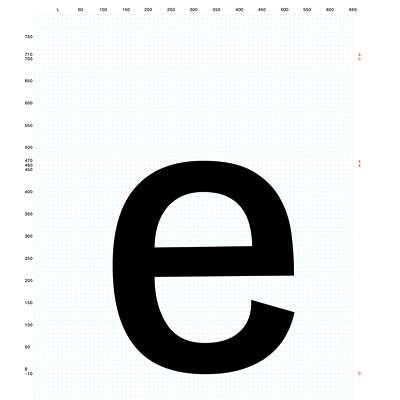
Type Specimen Book
30 typefaces, assigned by Simon Johnston. Designing a type specimen book is the exercise I would recommend to anyone who is interested in type setting. Simon is the most influential typography professor I trained under.
I worked with him as design assistant for several years. Here is a link opens up a new window to Simon's website I built in 2006.
—
Material: Print on paper
Dimension: 9 x 12 inches, gatefold


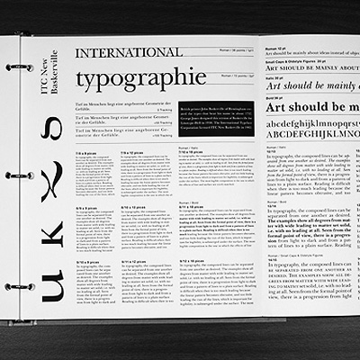

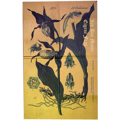
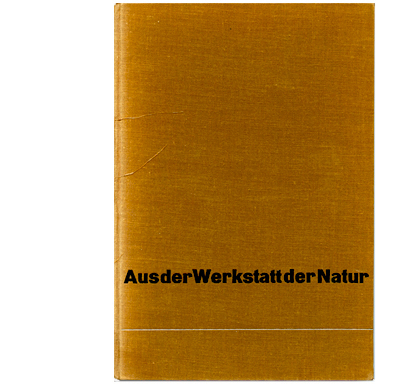
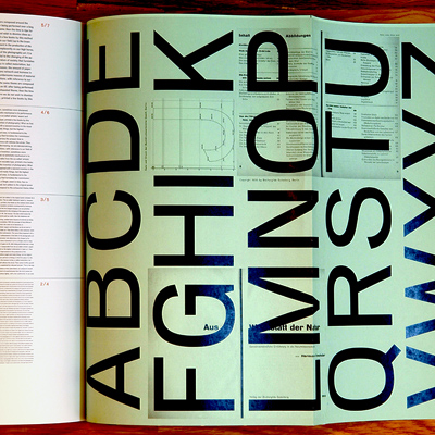
Cairoli Neretta
Aus der Werkstatt der Natur, designed by Jan Tschichold in 1930.
Worked with Tobias Frere-Jones in the afternoon on Mondays. The font used in this book were redrew and exported digitally with FontLab Studio.
For more details:
hankhhuang@outlook.com


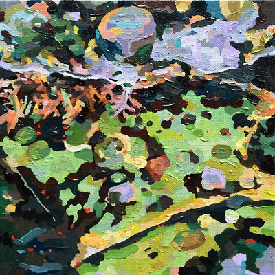
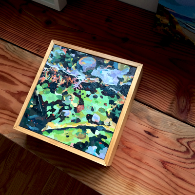
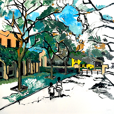
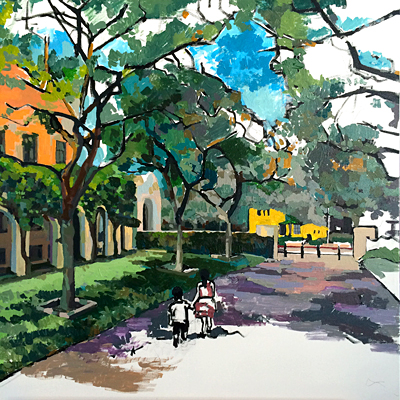
Sausalito
process in steps 1 to 4
acrylic paint on canvas
76.2 x 76.2 cm
2014


Green Points 綠點
My approach to a design competition funded by the Environmental Protection Administration of Taiwan. Each of the five various leaves were based on Phyllodium pulchellum — a perennial plant that most Taiwanese would recognize as "money tree" due to its coin-shaped leaves. Each color represents various participating organizations that have joined our EPA's cause. As a holistic mark, these five leaves are arranged to reflect the look of the Prunus mume blossom, Taiwan's national flower.


Chris Bangle Associates
Tornio, northern Italy.
Worked with Chris Bangle to visualize advance product concept for Samsung Electronics.
My experience with Chris was beyond words. His futuristic imagination, as well as his ability to cross-reference ideas from literature to sculpture was incredible to witness. I learned so much from him.
N.D.A. signed. For more details: hankhhuang@outlook.com


Johnson & Johnson Global Strategic Design Office N.Y. / Senior Designer
Collaborated with various design disciplines. Projects included: data visualization, user experience, user interface, user behavioral design strategy, product packaging, corporate branding, style guide, IFU for medical devices, and environmental design.
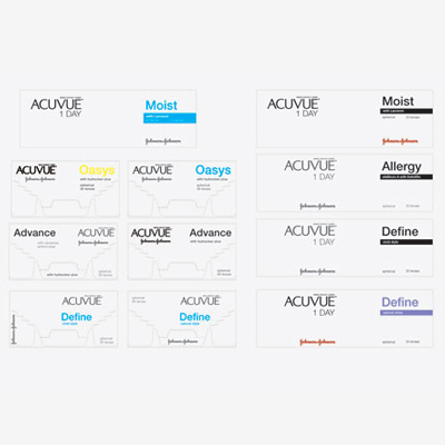
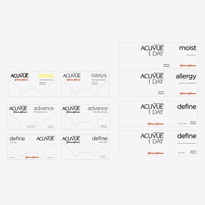
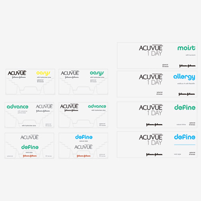
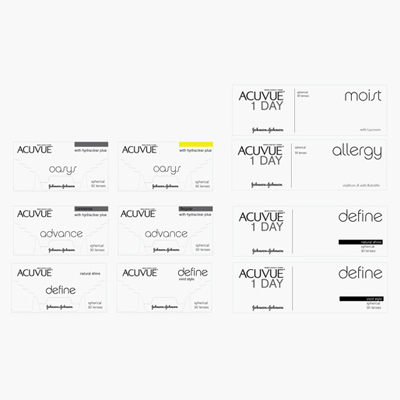
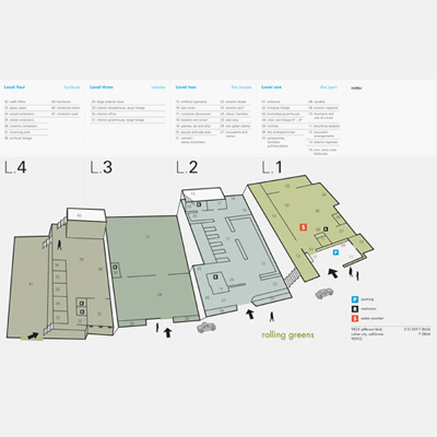
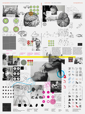
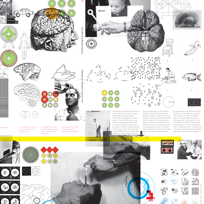
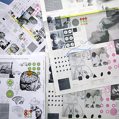
Images shown here is a graphic identity system I developed for a pharmaceutical research symposium.
N.D.A. signed. For more details: hankhhuang@outlook.com


From my work experience at Johnson & Johnson Global Strategic Design Office, I had the opportunity to work with cross-disciplinary teams to develop products that focused on healthcare with the goal of improving patients’ lives and their experience with medical devices. We strongly believed that user experience has a role in defining the future of healthcare and made the effort to insert design research much earlier into the process. This allowed us to design materials to help us observe the interactions between physicians, patients and caregivers. As a result, we were able to identify and design user-centered solutions that were highly attuned to patients’ needs. ➝
This experience taught me that designers can have an integral role and make exceptional contributions — especially when working with disciplines or fields outside of what is traditionally celebrated as ‘graphic design’.
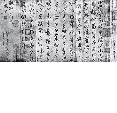
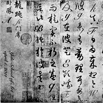
Poster design announcing Matthew Carter's visit to Yale School of Art.
Printed monologue that captures the elegance and form of well-crafted characters regardless of language, era, or technologies. Letterforms used are from two calligraphy / typography masters: 王羲之 Wang Xizhi, an eastern calligrapher from the 16th century and Matthew Carter, a western letterform designer from the 21st century.
—
Material: Print on paper
Dimension: 60 x 24 inches

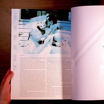
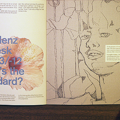
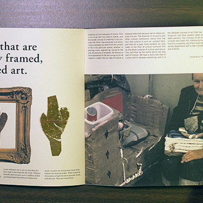
My favorite things: M.F.A. thesis
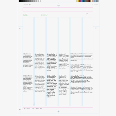
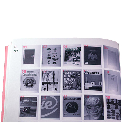
A melody can be performed by anyone with any instrument. Likewise, design is the crafting of an idea that can be expressed in a variety of ways — and each variation makes way for a particular point of view, message or nuance to be taken in by the recipient. This book explains and documents my work process from raw sketches to final execution of various projects completed during my time at Yale University.
—
Dimension: 7.5 x 10 x 0.75 inches
Softcover, 238 pages
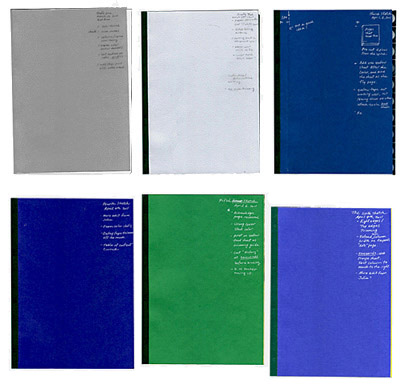


Standard page spread:
Online exhibition project advised by Daniel van der Velden. My intention was to examine and deconstruct the underlying tension that exists between the actual and the digital self. The online experience was designed so viewers can experience first hand the fragility of online identities.
To demonstrate my theory, a link opens up a new window to Standard web page.


Poster announcing Irma Boom's visit to Yale School of Art.
I see Ms. Boom's work as sculptural objects that contain information. For her announcement, I decided to make paper block-books with recycled materials to reflect Ms. Boom's work and draw attention to her visit.
—
Dimension: 18 x 7 inches


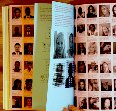
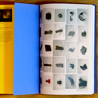
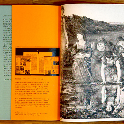
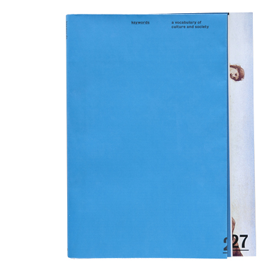
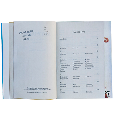
Keywords: One Picture is Worth a Thousand Words.
Mr. William's approach was to provide the context of words from a cultural point of view rather than etymological. I expanded the idea that Keywords started with and transferred it to a modern tool: google image search. By interacting with the online exhibition, users can come to their own conclusions based on observing the search results provided by two most spoken languages; Mandarin Chinese and English.
—
Material: Print on paper.
An interactive site is in progress.
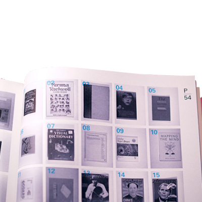
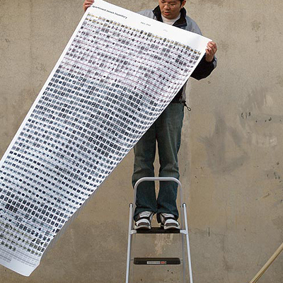
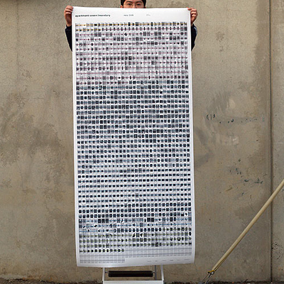
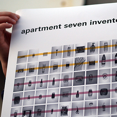
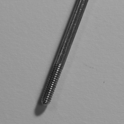
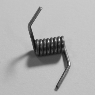
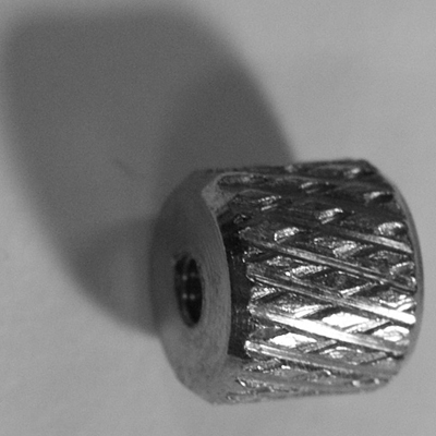
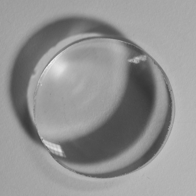
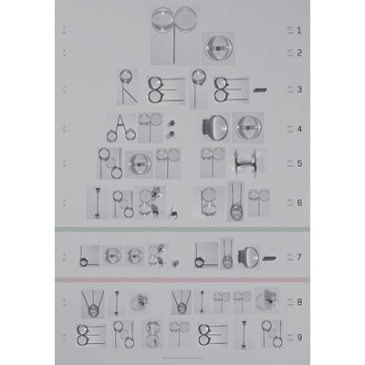
Jeweler’s loupe: One object, seven visual explorations.
I am fascinated by tools that were built for improving human capabilities. This series of work is my conceptual exploration of an object that serves one specific purpose.
Explorations: Entomological collection, Extended eyelashes, embellished Home Shopping Network Video, enlarged parts, eye exam charts, inventory index, and rocks as diamonds.


umma
process in steps 1 to 4
acrylic paint on canvas
50.8 x 50.8 cm
2014


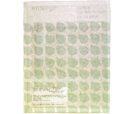
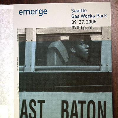
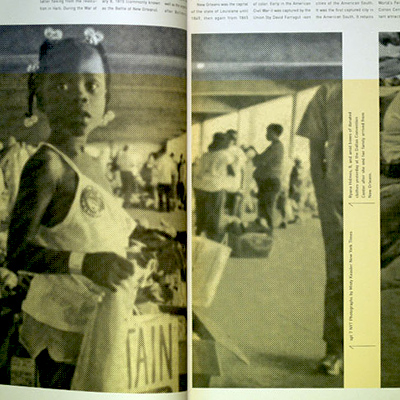
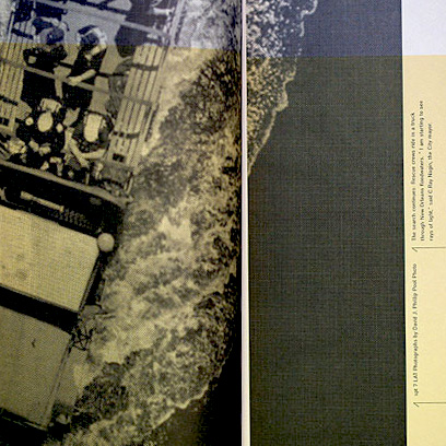
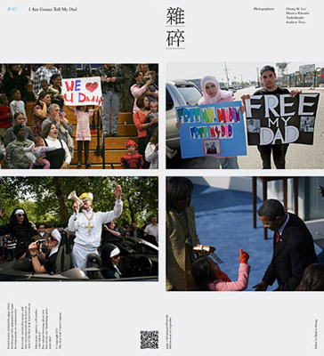
Za-Sui
A project with Linda Van Deursen.
Za-Sui is an image rearrangement using the New York times image archive. Four images that relate to communication were juxtaposed to tell an unique visual story. Each sheet is intended to be a weekly publication sent out by mail.
—
Material: Print on paper
Dimension: 24 x 7 inches


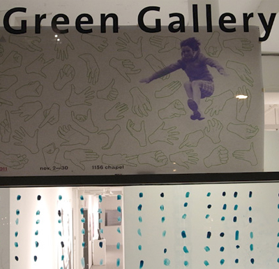
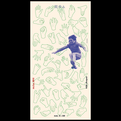
Fifty One
Poster announcing the first exhibition of work by 51 students from Yale School of Art at Green Gallery.
I drew 51 hands to represent that all of the work in the exhibition were made by hands and one child making her first long jump at a sport event.
—
Material: Print on paper
Dimension: 36 x 72 inches
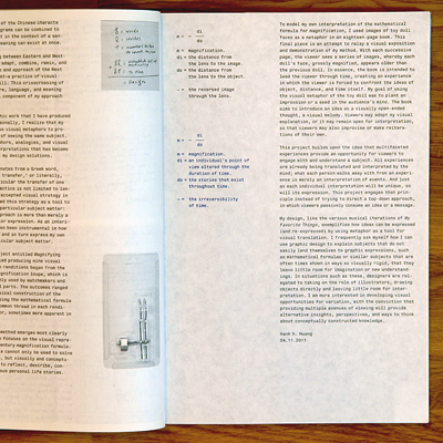
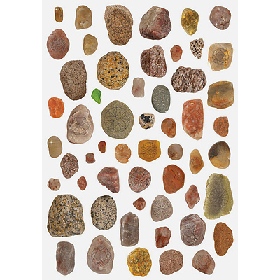
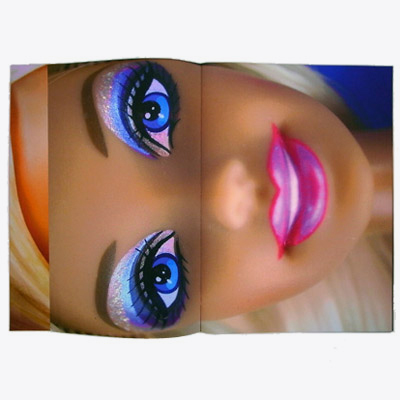
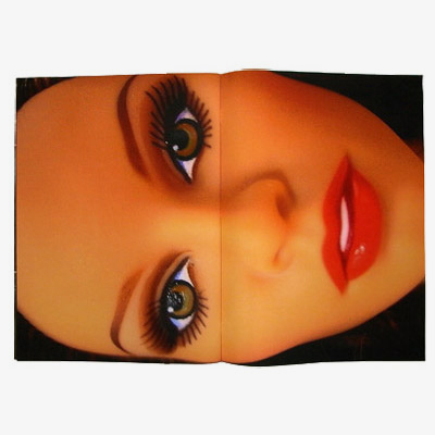
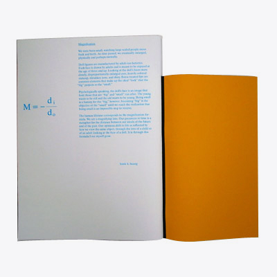
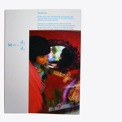
Magnification Formula
A series of images as the visual interpretation of a mathematical formula M= -Di / Do.
To demonstrate my analogy of the magnification formula, I used the imagery of doll faces and how they reflect ideas of girlhood / womanhood simultaneously while embodying different meanings for both.
—
Material: Print on paper
Dimension: 18 x 12 inches


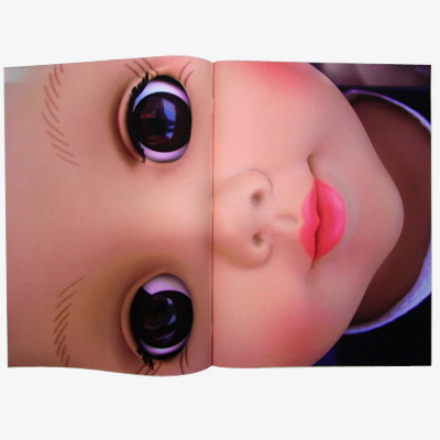
The magnification formula states that the degree of magnification is contingent on the distance of the object to the distance of the image of the object.
Conceptually applied, if an object were to represent a particular moment in our lives, the image of that moment would embody or capture one’s personal perspective of that event in time and space. And, if distance were to equal the duration of time, the “distance” between experience (object) and perception (image) is inextricably linked. In other words, the meaning of an object is directly and, equally important, dynamically related to its representation in the time space continuum. The accompanying images on this page are from a project that attempts
to model the exposition and demonstration of my method. Using the magnification formula as a conceptual springboard, I decided to use the doll as my object. To children, dolls represent the future, where, through play, they can imagine what being an adult would be like. For adults, on the other hand, dolls represent something else entirely: the past, nostalgia, and childhood, perhaps.
The object is the same, however it is when one encounters the image of the object – be it as a child or an adult – its representation takes on very different meanings. This formula, in a way, is a fluid platform, where the answer discovered depends on each individual’s unique experience.


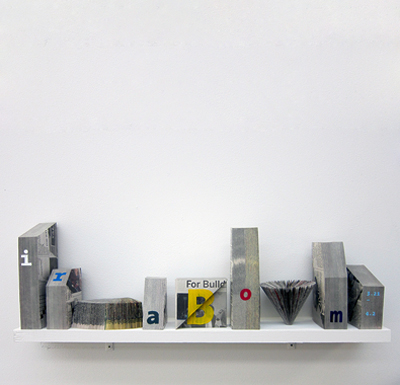
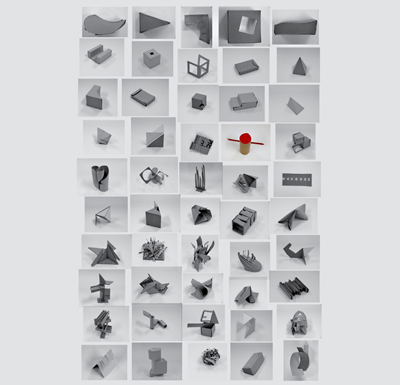
Shapes
Exercise in variation and exploration of surface and form using found, everyday materials.
—
Duration: 100 days
Material: Recycled cartons
Dimension: 6 x 6 inches

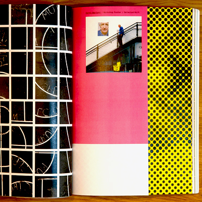
Poster announcing Karel Martens' visit to Yale School of Art.
My intention was to make a completely subjective poster that used the printing technique as an homage to the dutch graphic design master. Karel and I had a conversation later on how he achieved his print by angling the ink plates by various degrees and mine was to manipulate the settings on the large format epson plotter. His method is way cooler!
—
Material: Print on paper
Dimension: 26 x 34 inches

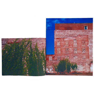
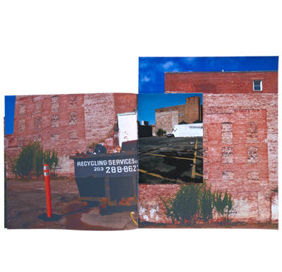
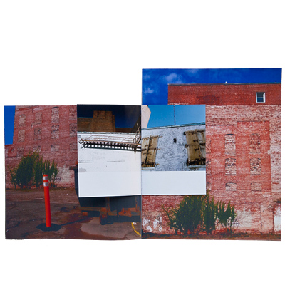
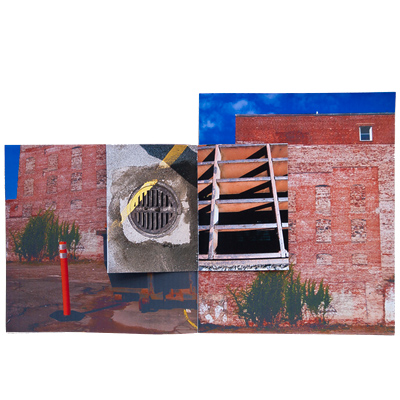
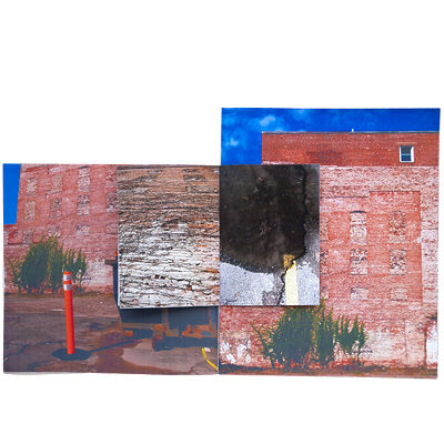
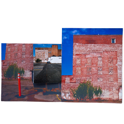
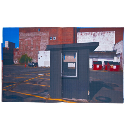
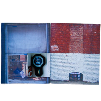
Parking Lot and the attendant
As I walked around New Haven, there is a wall structure by a parking lot that attracted my attention. What intrigued me was a wall that graphically revealed the history of its construction. I could imagine how the windows were once filled, and layers of new bricks were laid on top of the old ones. My interest in this wall led me to befriend the parking booth attendant. We talked about his family and religion. Later, I give this book to him send to his family in Africa.
—
Material: Print on paper


Domain
An assignment given by Karel Martens. The challenge is to act on a word: Domain. My visual translation was to refer to lines used in sports. In sports, lines symbolize boundaries, territories, and rules—they also define how and where the game is played. I documented lines from a local basketball course that was also graffitied by local gangs claiming their territory to display the juxtaposition of two competitive activities.
—
Material: Print on paper


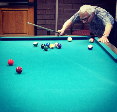
Thursdays, 8:30
"Always choose the right shot!" Mr. Danziger said to me. I shoot pool with Lou every Thursday morning. He is a walking design encyclopedia and a brilliant one-pocket player.
I have been fortunate to share my thoughts on my design teaching philosophy with Lou and realized my writing also reflects my design process. Though I never took his class as a student, Lou is the most exceptional design legend whom I respect greatly.
In addition to fundamental trainings in color theory, letterform, grid system, typography, composition, scale, craftsmanship and technology, there are five areas that I would like to focus on:
1. Stimulate curiosity and a unique personal point of view. Educational institutions provide a climate perfectly suited for encouraging creative minds to flourish. An authentic creative mind combined with an earnest attitude towards learning are reflected in the visual outcomes of a designer. My first goal as a teacher is to encourage a design solution that uses informed research filtered through a student's genuine point of view. ➝
3. Experiment in order to arrive at visual solutions that turn information into impactful and appropriate visual experience. Design is not a one-size-fits all practice. Having a preconceived stylistic visual approach will only result in a one dimensional visual experience which which has its limits. To arrive at impactful visual experience, a range of ➝
4. Develop skill in presentation and articulation. Graphic design does not live solely in visual form. Being able to speak about one’s work is as important as producing it. The designer’s ability to speak about how design decisions are made from concept development to execution often determines how the design is received by the client. I have found in my own practice that articulating design development to a non-design audience is often part of the design process. ➝
Hank H. / Dec. 2013